Deriving Exner Pressure and Air Temperature
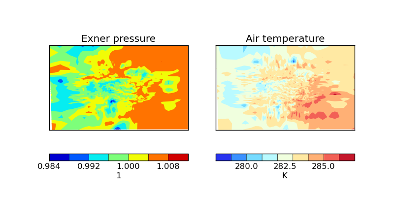
This example shows some processing of cubes in order to derive further related cubes; in this case the derived cubes are Exner pressure and air temperature which are calculated by combining air pressure, air potential temperature and specific humidity. Finally, the two new cubes are presented side-by-side in a plot.
"""
Deriving Exner Pressure and Air Temperature
===========================================

This example shows some processing of cubes in order to derive further related cubes; in this case
the derived cubes are Exner pressure and air temperature which are calculated by combining air pressure,
air potential temperature and specific humidity. Finally, the two new cubes are presented side-by-side in
a plot.


"""
import itertools
import matplotlib.pyplot as plt
import matplotlib.ticker

import iris
import iris.coords as coords
import iris.quickplot as qplt


def limit_colorbar_ticks(contour_object):
    """Takes a contour object which has an associated colorbar and limits the number of ticks on the colorbar to 4."""
    colorbar = contour_object.colorbar[0]
    colorbar.locator = matplotlib.ticker.MaxNLocator(4)
    colorbar.update_ticks()


def main():
    fname = iris.sample_data_path('colpex.pp')

    # the list of phenomena of interest
    phenomena = ['air_potential_temperature', 'air_pressure']

    # define the constraint on standard name and model level
    constraints = [iris.Constraint(phenom, model_level_number=1) for phenom in phenomena]

    air_potential_temperature, air_pressure = iris.load_strict(fname, constraints)

    # define a coordinate which represents 1000 hPa
    p0 = coords.AuxCoord(100000, long_name='P0', units='Pa')

    # calculate Exner pressure
    exner_pressure = (air_pressure / p0) ** (287.05 / 1005.0)
    # set the standard name (the unit is scalar)
    exner_pressure.rename('exner_pressure')


    # calculate air_temp
    air_temperature = exner_pressure * air_potential_temperature
    # set phenomenon definition and unit
    air_temperature.standard_name = 'air_temperature'
    air_temperature.units = 'K'


    # Now create an iterator which will give us lat lon slices of exner pressure and air temperature in
    # the form [exner_slice, air_temp_slice]
    lat_lon_slice_pairs = itertools.izip(
                                         exner_pressure.slices(['grid_latitude', 'grid_longitude']),
                                         air_temperature.slices(['grid_latitude', 'grid_longitude'])
                                         )
    plt.figure(figsize=(8, 4))

    for exner_slice, air_temp_slice in lat_lon_slice_pairs:
        plt.subplot(121)
        cont = qplt.contourf(exner_slice)

        # The default colorbar has a few too many ticks on it, causing text to overlap. Therefore, limit the number of ticks
        limit_colorbar_ticks(cont)

        plt.subplot(122)
        cont = qplt.contourf(air_temp_slice)
        limit_colorbar_ticks(cont)
        plt.show()

        # For the purposes of this example, break after the first loop - we only want to demonstrate the first plot
        break


if __name__ == '__main__':
    main()