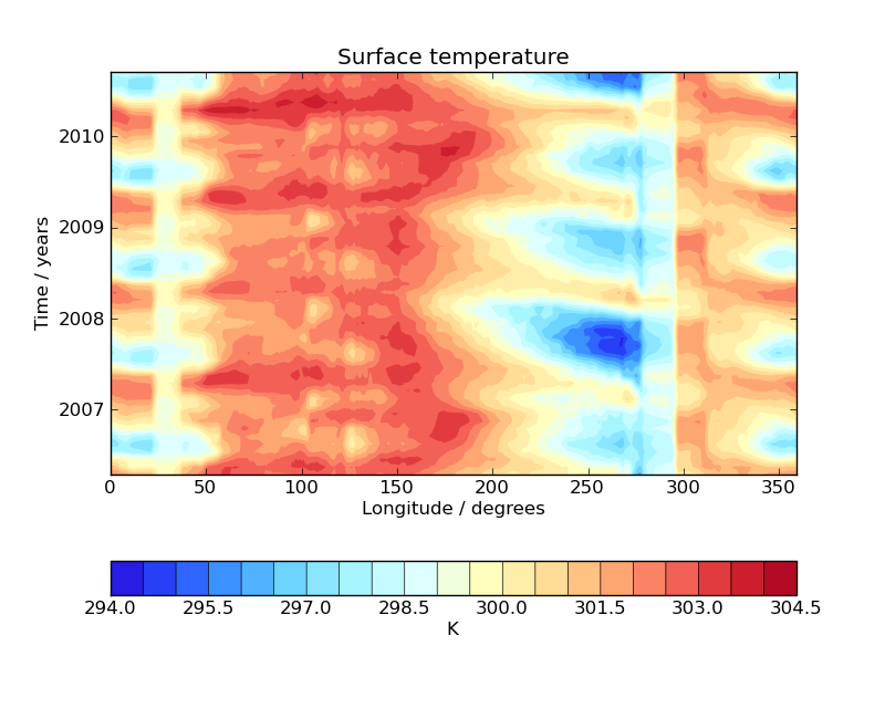
Hovmoller diagram of monthly surface temperature
This example demonstrates the creation of a Hovmoller diagram with fine control over plot ticks and labels. The data comes from the Met Office OSTIA project and has been pre-processed to calculate the monthly mean sea surface temperature.
"""
Hovmoller diagram of monthly surface temperature
================================================

This example demonstrates the creation of a Hovmoller diagram with fine control over plot ticks and labels.
The data comes from the Met Office OSTIA project and has been pre-processed to calculate the monthly mean sea
surface temperature.

"""
import matplotlib.pyplot as plt
import matplotlib.dates as mdates

import iris
import iris.quickplot as qplt
import iris.unit


def main():
    fname = iris.sample_data_path('ostia_monthly.nc')

    # load a single cube of surface temperature between +/- 5 latitude
    cube = iris.load_strict(fname, iris.Constraint('surface_temperature', latitude=lambda v: -5 < v < 5))

    # Take the mean over latitude
    cube = cube.collapsed('latitude', iris.analysis.MEAN)

    # Now that we have our data in a nice way, lets create the plot
    # contour with 20 levels
    qplt.contourf(cube, 20)

    # Put a custom label on the y axis
    plt.ylabel('Time / years')

    # Stop matplotlib providing clever axes range padding
    plt.axis('tight')

    # As we are plotting annual variability, put years as the y ticks
    plt.gca().yaxis.set_major_locator(mdates.YearLocator())

    # And format the ticks to just show the year
    plt.gca().yaxis.set_major_formatter(mdates.DateFormatter('%Y'))

    plt.show()


if __name__ == '__main__':
    main()